Seety Logo Design
Quick & Reliable Appliance Repair
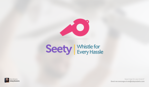
Seety logo design represents speed, reliability, and convenience. As a household appliance service and repair agency, Seety needed a brand identity that reflected its prompt response and customer-friendly approach. Since housewives are the primary users of this service, the logo was designed to appeal to them with a warm and approachable look.
Design Approach
Concept
A whistle symbol to emphasize quick service, just like “your repair solution is just a whistle away.”
Color Palette
Feminine, inviting colors to connect with homemakers.
Typography
Clean and modern fonts for a professional yet approachable feel.
Symbolism
The whistle highlights fast response, reliability, and ease of service.
Results
The final Seety logo design successfully captures the brand’s mission of providing quick and efficient repair solutions. The thoughtful design elements make it visually appealing and memorable.
Need a Logo That Speaks to Your Audience?
Let’s create the perfect identity for your brand!
More Case Studies
Let’s Collaborate and Create Something Great!
Together, we can turn your ideas into impactful designs that leave a lasting impression.


