Mediwon Logo Design
A Perfect Balance of Health & Wellness
Mediwon logo design reflects balance, health, and inclusivity. As a pharmaceutical company focused on multivitamin and herbal products, Mediwon wanted a brand identity that resonated with both men and women. The goal was to create a logo that symbolized vitality while maintaining a professional and trustworthy look.
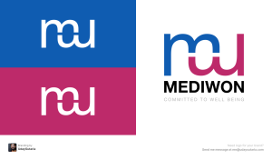
Design Approach
Concept
The logo subtly integrates ‘M’ and ‘W’ to represent Men and Women.
Color Palette
Blue for masculinity, trust, and reliability; Purple for femininity, wellness, and balance.
Typography
A modern, clean font to ensure a professional yet approachable feel.
Symbolism
A perfect blend of masculine and feminine elements to highlight holistic health.
Additional Branding Elements
Medication Box Packaging – A clean and vibrant layout for clear product communication.
Labels & Visual Aid – Structured and engaging designs for better product presentation.
Business Stationery – A cohesive brand identity across all materials.
Results
The final Mediwon logo design successfully represents the brand’s focus on holistic wellness. It visually communicates trust, balance, and inclusivity in healthcare.
Need a Brand Identity That Speaks to Your Audience?
Let’s create something unique for your brand!
More Case Studies
Let’s Collaborate and Create Something Great!
Together, we can turn your ideas into impactful designs that leave a lasting impression.


