
Arver Lastbilar
UX/UI Design for a Heavy-Duty B2B Dealership
Humanizing industrial sales and streamlining complex service pathways for an authorized Scania dealer.
Role: UX/UI Product Designer
Client: Arver Lastbilar (Scania Dealer, Sweden)
Deliverables: B2B Information Architecture, UI/UX Design, Custom Iconography System, Responsive Web Strategy.
The Challenge (The Problem)
Industrial and heavy machinery websites are notoriously difficult to navigate. Dealerships like Arver don't just sell trucks; they manage complex ecosystems involving fleet sales, emergency repairs, spare parts, and vehicle rentals. B2B clients visiting the site are often in high-stress, high-intent situations (e.g., a truck has broken down and needs immediate service). The challenge was to take this massive, complex catalog of services and organize it into a frictionless, intent-driven interface, while simultaneously humanizing the brand to build long-term B2B trust.
Strategic Approach
Humanizing the B2B Experience
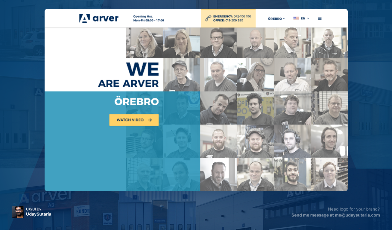
Instead of leading with a generic stock photo of a truck, the hero section utilizes a dynamic grid featuring the actual faces of the Arver Örebro team. In the B2B sector, people buy from people. By leading with the team and a clear "Watch Video" CTA, the UI immediately establishes trust and transparency.
Intent-Driven Routing (The Core UX)
Directly below the hero, the "What can we help you with today?" section is a masterclass in UX routing. Rather than burying services in a dropdown menu, the UI presents a central Scania truck surrounded by four distinct, icon-driven action paths (Service, Buy, Spare Parts, Rent). This allows users to self-segment immediately based on their urgent needs, bypassing irrelevant information.
Handling Complex Data (Information Architecture)
Arver offers dozens of highly technical services (e.g., tachograph data, roller brake tests). To prevent cognitive overload, the "Services We Offer" section chunks this data using a dense, yet scannable, grid of custom-designed line icons. This turns a boring, overwhelming bulleted list into an engaging visual index.
Social Proof & Conversion
The UI strategically places modular content blocks like "Latest Deliveries" and "Offers" further down the page. Showcasing recent truck deliveries acts as powerful social proof, signaling to prospective fleet managers that Arver is an active, trusted partner in the region.
Visual Language
The color palette relies heavily on an authoritative, industrial blue paired with a high-contrast safety yellow for primary CTAs (Call to Actions). This ensures buttons grab attention instantly while aligning seamlessly with the global Scania brand standards.
The Identity System (Visuals)
The Result
The redesigned Arver platform transforms a complex industrial catalog into a streamlined, user-first digital experience. By anticipating the user's intent and providing clear, frictionless pathways to critical services, the UI reduces bounce rates and accelerates lead generation. The design successfully balances the corporate authority of the Scania brand with the local, human touch of the Arver team.