
Sybro Properties
UX/UI Design for Real Estate
Streamlining the tenant experience and modernizing a family-owned property firm through intuitive digital architecture.
Role: UX/UI Product Designer
Client: Sybro Fastigheter (Swedish Real Estate)
Deliverables: Information Architecture, End-to-End UI Design, Iconography System, Responsive Web Design.
The Challenge (The Problem)
In the competitive Food & Beverage market, a website cannot just be an informational brochure; it must instantly stimulate appetite and convey the brand's energy. ShakeUp required a digital storefront that mirrored the fun, refreshing, and dynamic nature of their handcrafted milkshakes. The challenge was to break away from rigid, corporate web grids to create a playful interface, while still maintaining clear, accessible navigation pathways for both everyday consumers and potential B2B franchise partners.
Strategic Approach
Dual-Pathway Information Architecture
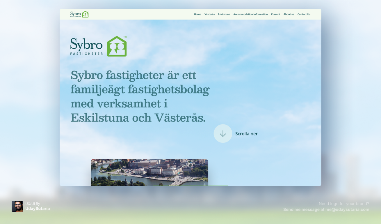
To solve the dual-audience dilemma, the page layout follows a strict chronological user intent map. The top half of the site (Hero and staggered City Cards) is engineered for discovery, capturing prospective renters looking at Eskilstuna and Västerås. As the user scrolls, the layout shifts to utility: a comprehensive, icon-driven "Tenant Information" grid, followed by massive, high-contrast buttons for fault reporting (Felrapportering).
Visual Rhythm & Z-Pattern Scanning
To prevent cognitive fatigue on a long-scrolling page, the layout employs alternating light and dark background bands (a deep, trustworthy teal against clean off-white). In the upper section, the overlapping, staggered property cards create a natural Z-pattern for the eye, making the browsing experience feel dynamic rather than rigid.
Iconography & Data Chunking
Real estate platforms often bury tenant rules (subleasing, waste management, internet setup) in dense PDFs. To modernize this, I designed a 3-column grid utilizing clean, minimalist line icons. This "chunking" of data allows current tenants to scan, locate, and digest critical living information in seconds, significantly reducing support calls to the property managers.
Typographic Trust
To reflect the brand’s family-owned heritage, a classic, elegant serif typeface was chosen for primary headings. This was deliberately paired with a highly legible, modern sans-serif for body copy and UI elements, ensuring the platform met modern accessibility standards without losing its sense of established trust.
The Identity System (Visuals)
The Result
The Sybro Properties redesign successfully bridges the gap between heritage and modern digital utility. By structuring the user flow around intent, the new interface operates as a powerful lead-generation tool for new leases, while simultaneously serving as a frictionless, self-serve portal for current tenants. The result is an elevated brand perception and a more operationally efficient property management workflow.