
ShakeUp
UI/UX Design for a Beverage Brand
Crafting a fluid, craving-inducing digital experience to drive brand engagement and franchise growth.
Role: UX/UI Designer
Client: ShakeUp
Deliverables: Web Interface Design, Visual Strategy, Responsive Layouts.
The Challenge (The Problem)
In the competitive Food & Beverage market, a website cannot just be an informational brochure; it must instantly stimulate appetite and convey the brand's energy. ShakeUp required a digital storefront that mirrored the fun, refreshing, and dynamic nature of their handcrafted milkshakes. The challenge was to break away from rigid, corporate web grids to create a playful interface, while still maintaining clear, accessible navigation pathways for both everyday consumers and potential B2B franchise partners.
Strategic Approach
Visual Language & "Liquid" UI
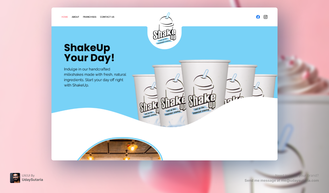
To immediately communicate the nature of the product, rigid straight lines and standard grid boxes were intentionally avoided. Instead, the UI employs fluid, wave-like section dividers. This organic, dripping aesthetic mimics the texture of a milkshake, creating a seamless, engaging scroll experience that keeps users moving down the page.
Navigation & Brand Anchoring
The central navigation bar features an oversized, breakout logo treatment that overlaps the hero section. This unconventional layout anchors the brand identity immediately at the top of the visual hierarchy. The navigation links are strategically grouped to separate consumer discovery ("About") from business acquisition ("Franchises"), reducing cognitive load for different target audiences.
Color Psychology & Contrast
A vibrant, refreshing sky-blue acts as the primary background color. This serves a strategic purpose: blue naturally contrasts with the warm, creamy tones of the milkshake products, forcing the product imagery to pop aggressively off the screen. This high-contrast approach maximizes visual impact and instantly triggers craving.
Typographic Voice
The hero typography ("ShakeUp Your Day!") utilizes a bold, heavy sans-serif typeface to convey confidence and energy. It is paired with a highly legible, clean secondary font for the supporting text, ensuring that the brand's playful voice never sacrifices readability or web accessibility.
The Identity System (Visuals)
The Result
The ShakeUp UI delivers a highly engaging, visually appetizing web experience. By combining fluid design elements with strategic color contrast and clear user pathways, the site effectively serves dual purposes: delighting everyday customers with a fun brand hub, while functioning as a professional, trust-building lead generation tool for franchise expansion.