
MahimaaTech
UX/UI Design for a Digital Agency
Designing a high-converting, trust-building web experience that showcases creative and technical expertise.
Role: UX/UI Product Designer
Client: MahimaaTech
Deliverables: Information Architecture, Wireframing, High-Fidelity UI Design, Responsive Web Design.
The Challenge (The Problem)
For a digital and design agency, the website is the ultimate portfolio piece. If the user experience is cluttered or the visual design is outdated, potential clients will immediately bounce. MahimaaTech needed a digital presence that instantly communicated innovation, structure, and creativity. The challenge was to design an interface that effectively organized their diverse service offerings while keeping the cognitive load low and driving users toward a clear conversion point (getting in touch).
Strategic Approach
Information Architecture & Navigation
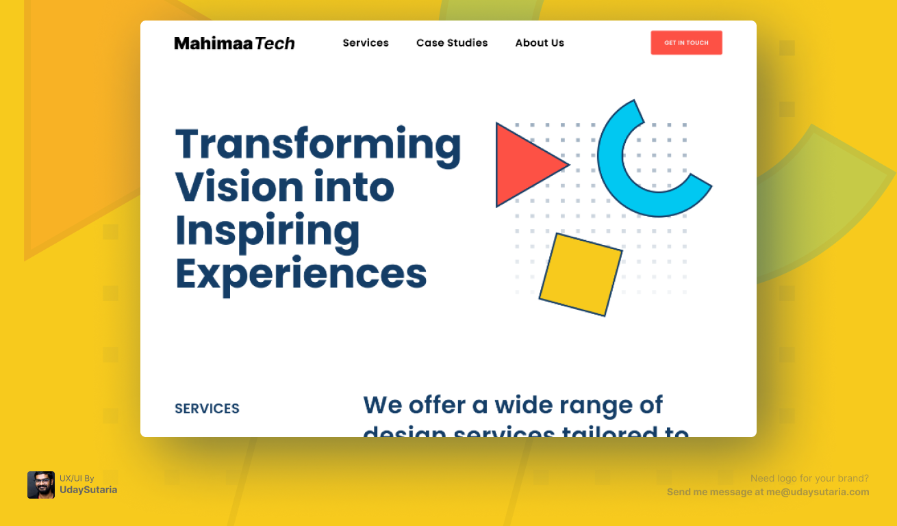
To prevent user overwhelm, the top-level navigation was intentionally stripped back to the absolute essentials: Services, Case Studies, and About Us. This clear, linear progression mirrors the psychological journey of a prospective client—understanding the offering, verifying the proof, and connecting with the team. A high-contrast, primary "Get in Touch" CTA was anchored to the top right to ensure the conversion funnel is always accessible.
Visual Hierarchy & Typography
The hero section employs a stark, confident visual hierarchy. The core value proposition—"Transforming Vision into Inspiring Experiences"—is set in a bold, oversized navy geometric sans-serif. By utilizing massive contrast against the clean white background, the user's eye is forced directly to the messaging first, before scanning down to the supporting service details.
Abstract Visual Language
Rather than relying on generic stock photography of "people at computers," the UI utilizes a bespoke system of abstract geometric shapes (triangles, circles, squares) layered over a precision dotted grid. This visually represents MahimaaTech's core philosophy: taking foundational building blocks (code and design) and structuring them into creative, out-of-the-box digital solutions.
Strategic Color Palette
The primary interface remains neutral (deep navy and white) to ensure accessibility and readability. However, strategic pops of vibrant colors—specifically the coral/red used for the primary CTA button and accent shapes—are deployed exclusively to draw the user's attention to interactive elements and critical focal points.
The Identity System (Visuals)
The Result
The redesigned MahimaaTech website serves as a powerful digital storefront. By prioritizing extreme clarity, generous whitespace, and a striking visual language, the new UI reduces friction in the user journey. The result is a premium, trustworthy digital experience that not only tells the story of the agency but actively guides prospects toward initiating a project.