
La Regina
Brand Identity for a Culinary Fusion
Positioning a premium Italian food brand for the local market by balancing authentic heritage with accessible, health-conscious messaging.
Role: Brand Designer
Client: La Regina
Deliverables: Logo Design, Badge System, Typography, Brand Color Palette.
The Challenge (The Problem)
Creating a brand identity for a crossover culinary brand requires careful cultural balancing. La Regina needed to establish itself as an authentic, high-quality Italian food purveyor while directly appealing to a local Indian demographic looking for a healthy lifestyle integration. The challenge was to design a mark that felt premium and imported, yet remained highly accessible and versatile enough to function as a trust badge on FMCG packaging (such as pasta boxes or sauce jars).
Strategic Approach
Concept & Symbolism
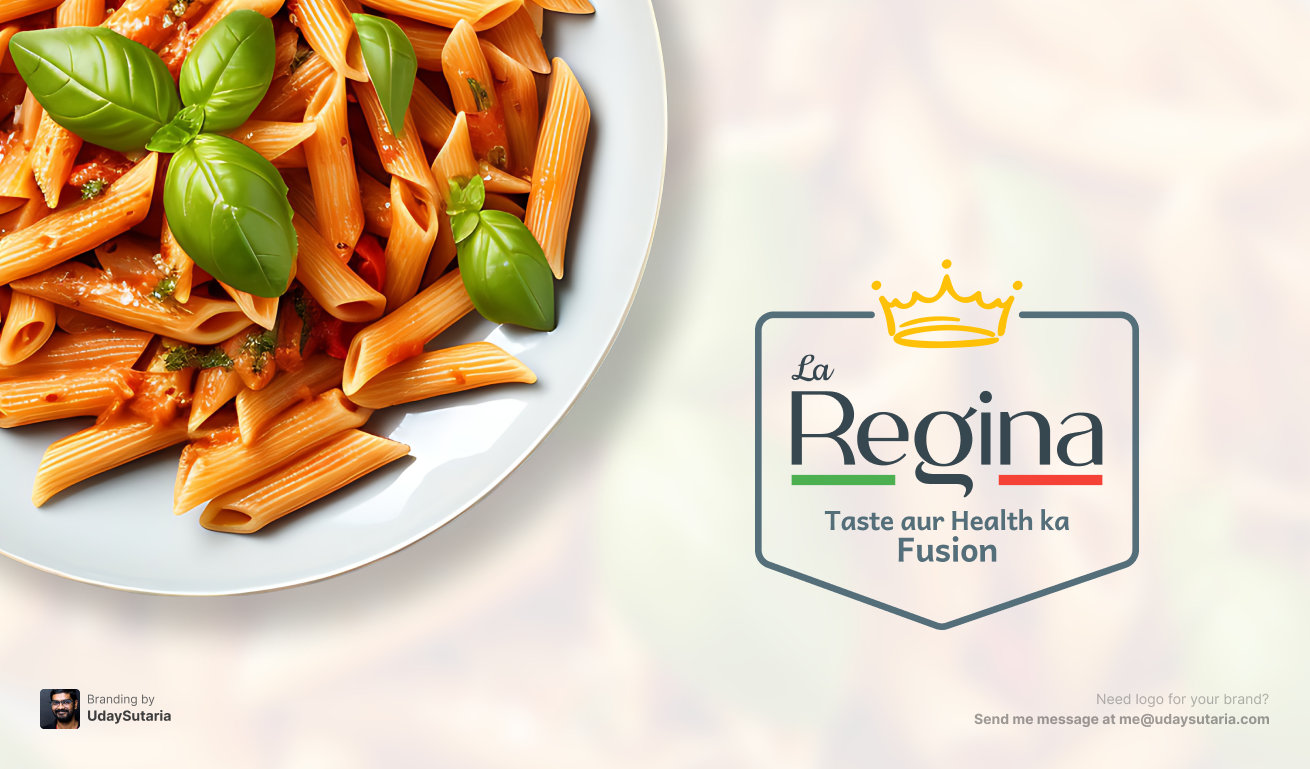
The brand name translates to "The Queen" in Italian, which is visually anchored by a minimalist, golden crown crest. To give the brand a stamp of authority and authenticity, the elements are housed within a structured, geometric badge container. This shield-like outline mimics traditional European food export labels but is stripped of unnecessary clutter for a clean, modern aesthetic.
Cultural & Market Integration
To instantly communicate the product's origin, a refined representation of the Italian flag (green and red bars) acts as a structural underline beneath the primary wordmark. Beneath this, the Hinglish tagline ("Taste aur Health ka Fusion") successfully grounds the premium European visual in the local market, explicitly communicating the brand's unique value proposition to the target audience.
Color Psychology
Instead of relying entirely on heavy, traditional Italian reds and greens, the brand utilizes a sophisticated slate-grey for the badge and primary typography. This neutral anchor allows the vibrant gold of the crown and the flag accents to pop, pairing perfectly with rich, high-contrast food photography.
Typographic Hierarchy
A deliberate three-tier typographic system was implemented. The article "La" is set in a fluid, handcrafted script to evoke artisanal, culinary elegance. "Regina" utilizes a bold, high-contrast serif typeface, establishing a strong, authoritative foundation. Finally, the tagline is set in a highly legible sans-serif, ensuring readability at small scales on retail shelves.
The Identity System (Visuals)
The Result
The resulting identity successfully bridges the gap between premium European aesthetics and local market accessibility. The La Regina badge functions as a recognizable seal of quality, giving the brand a highly versatile and scalable face that stands out on crowded grocery shelves while communicating a clear, health-conscious culinary message.