
SpicySigdi
Brand Identity for Authentic Culinary Experiences
Blending traditional cooking methods with a playful, modern visual identity to attract today's foodies.
Role: Brand Designer
Client: SpicySigdi
Deliverables: Logo Design, Character/Mascot Illustration, Typography System, Brand Color Palette.
The Challenge (The Problem)
The food and hospitality sector is fiercely competitive, and new restaurants or food brands must immediately capture attention while communicating their unique value. SpicySigdi needed a visual identity that highlighted their core differentiator: authentic, fiery flavors cooked using traditional methods (the sigdi, or coal stove). The challenge was to illustrate this traditional aspect without looking outdated or overly rustic, ensuring the brand felt approachable, fun, and highly appealing to a younger, casual "foodie" demographic.
Strategic Approach
Concept & Symbolism
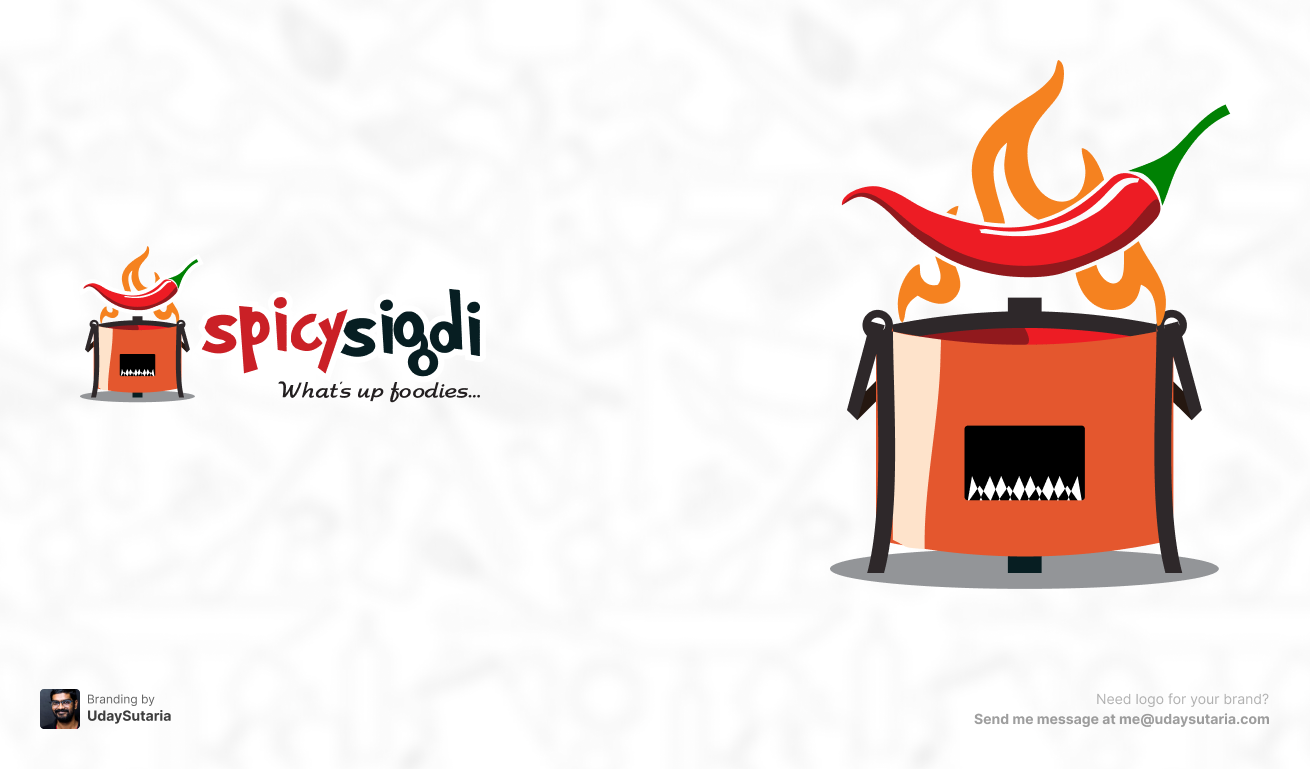
The core mark is a stylized, illustrative representation of the brand name itself. It features a traditional Indian sigdi roaring with flames, actively roasting a vibrant, oversized red chili. This literal translation immediately communicates the brand's USP—bold, spicy, and authentic. By rendering the stove and chili with clean vector lines and subtle highlights, the traditional concept is modernized and optimized for digital scaling (like food delivery apps).
Color Psychology
The palette relies heavily on warm, appetite-stimulating colors. The fiery red of the chili and the "spicy" typography instantly signals bold, hot flavors. This is balanced by the warm copper and orange tones of the stove and flames, evoking a sense of culinary warmth and freshly cooked meals. Deep charcoal black is used for the stove's hardware and the "sigdi" text, grounding the vibrant colors and ensuring high contrast.
Typographic Hierarchy
The primary wordmark utilizes a custom, playful, and slightly irregular sans-serif typeface. This bouncing baseline makes the brand feel casual, energetic, and highly approachable. To aid readability and reinforce the brand name, a clear color split was applied ("spicy" in red, "sigdi" in black). The secondary tagline, "What's up foodies...", is set in a casual, handwritten script, directly addressing the target audience with a conversational, friendly brand voice.
The Identity System (Visuals)
The Result
The resulting identity successfully bridges the gap between traditional authenticity and modern casual dining. The vibrant, illustrative logo gives SpicySigdi a highly recognizable and energetic face that stands out in crowded food delivery feeds. It perfectly captures the fiery essence of the cuisine while welcoming food lovers with a playful, unpretentious charm.