
Platinum Infotech
Brand Identity for a Technology Leader
Architecting a visual identity that communicates premium trust, structured data, and technological innovation.
Role: Brand Designer
Client: Platinum Infotech
Deliverables: Logo Design, Geometric Mark Construction, Typography System, Color Rationale.
The Challenge (The Problem)
The IT and technological infrastructure space is highly competitive and often saturated with generic, overused visual tropes. Platinum Infotech required an identity that highlighted their technical proficiency while establishing their status as a premium, reliable enterprise partner. The core challenge was to visualize abstract, complex concepts—like "data architecture" and "system connectivity"—while anchoring the brand in a sense of established authority and trust.
Strategic Approach
Concept & Geometric Construction
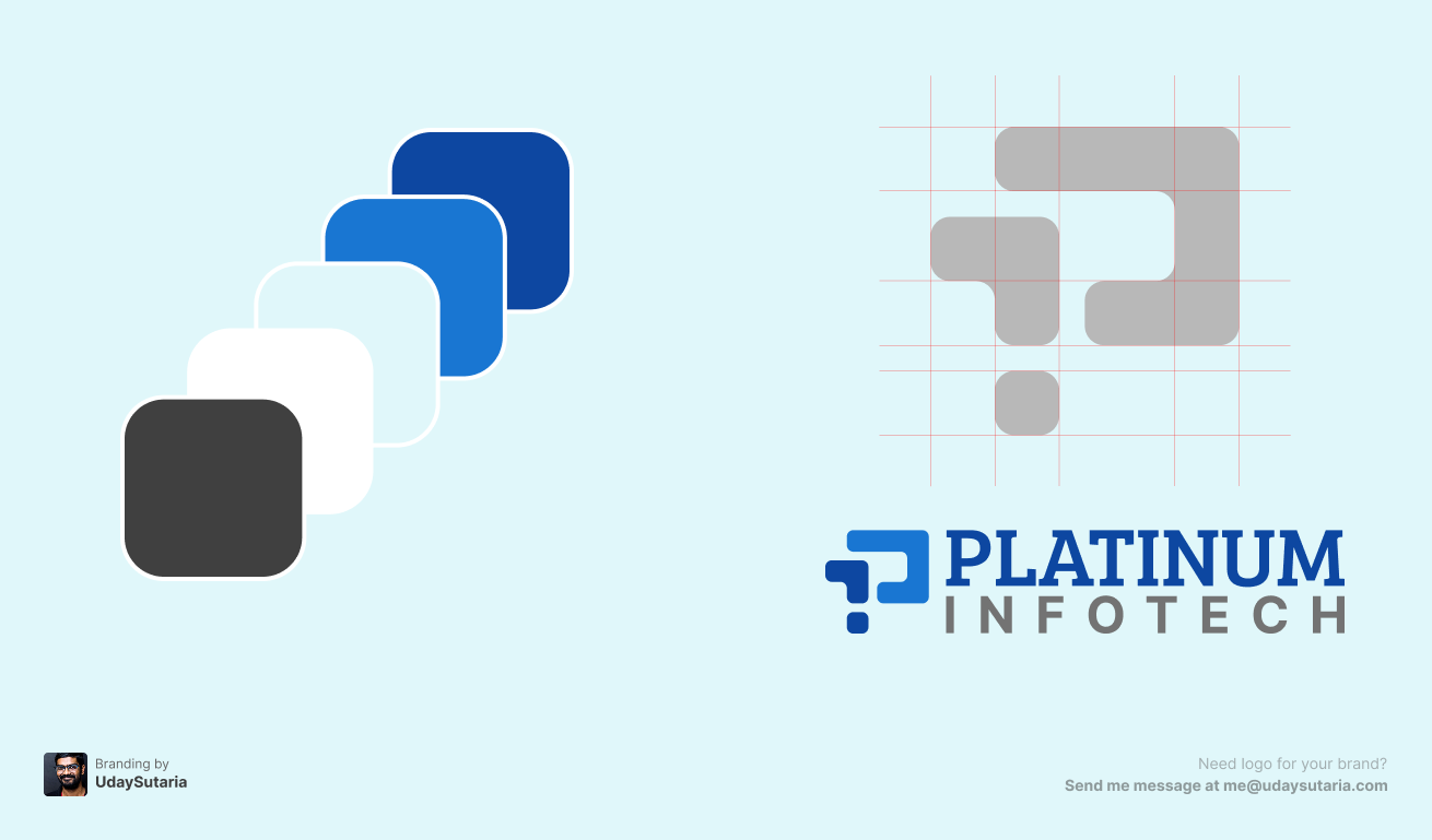
The core mark is a precision-engineered, abstract letter 'P'. As demonstrated by the underlying construction grid, the symbol is built using modular, rounded geometric blocks. These interconnected forms symbolize data nodes, robust IT infrastructure, and seamless digital connectivity. The strategic use of negative space ensures the mark remains legible and scalable at micro-sizes (like browser favicons) and large formats.
Color Psychology & Progression
The identity utilizes a classic corporate tech palette elevated by a modern progression of tones. The conceptual color sequence—moving from a grounding dark charcoal through transitional whites and light blues to a deep, authoritative navy—represents the transformation, processing, and clarity of data. The final two-tone blue applied to the logo mark instantly inspires feelings of security, stability, and corporate trust.
Typographic Hierarchy
A dual-typographic approach was implemented to create a striking balance between legacy and innovation. The primary wordmark, "PLATINUM," is set in a bold, confident serif typeface, instantly communicating premium quality and established authority. In sharp contrast, the secondary text, "INFOTECH," utilizes a clean, tracked-out sans-serif font. This grounds the logo in modern, forward-thinking technology, ensuring the overall aesthetic doesn't feel dated.
The Identity System (Visuals)
The Result
The resulting identity positions Platinum Infotech as a robust, premium player in the tech industry. The mathematical precision of the geometric mark, combined with the authoritative typography, gives the brand a highly scalable and trustworthy face. It successfully appeals to enterprise stakeholders who require both cutting-edge technical execution and unshakeable reliability.